Case study: building a marathon-training app
A closer look at the research and development of an adaptive marathon-training app.
Role
Industry
Duration

Overview
This project began with a simple observation while training for a half marathon - traditional training plans are too rigid for real life, leading to frustration and eventual abandonment across all experience levels. This insight led to the development of Relay, an adaptive training companion designed to grow with runners.
UX Research - Understanding Users
My research began with in-depth interviews with five diverse runners, ranging from beginners to seasoned marathoners. Each 22-32 minute session revealed a consistent pattern: the struggle wasn't with running itself, but with maintaining consistency amid life's interruptions. Among our participants, Abbey's experience proved particularly illuminating. As a 31-year-old professional who had completed two half marathons, she embodied our key user segment. Her quote, "I use my airpods for everything when I'm running. I like that the during run page is so simple and easy to read while in motion," became a guiding principle for our interface design.
The Challenge
Through our research, three core challenges emerged that affected runners across experience levels. First, the fundamental tension between structured training and life's demands created a constant struggle. Second, information overload during runs compromised safety and enjoyment. Third, runners felt isolated in their training journey, lacking the support needed to stay motivated. These challenges manifested in high training plan abandonment rates from a business perspective and increased training anxiety from a user perspective.
Our Solution
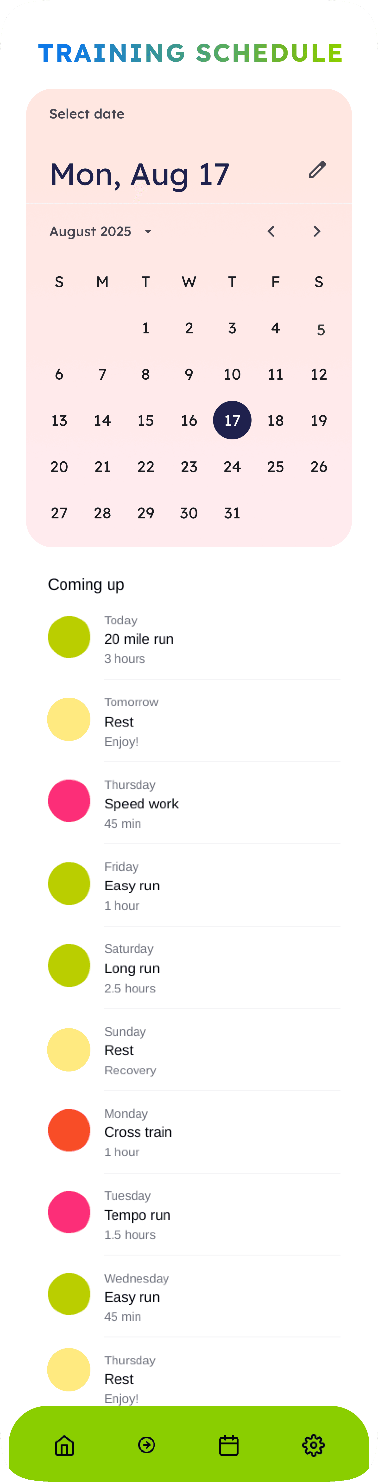
Relay's solution centered on adaptive training plan that responds to each runner's changing needs. The core of our approach was a flexible calendar system that tracks progress despite irregular patterns, complemented by a minimalist run interface that prioritizes safety and clarity. Most importantly, the experience adapts to each runner's skill level, providing appropriate guidance without overwhelming them.
Below is an image of the one of the previous iterations of this design. We will detail the improvements that were made after this.

Design Process and Evolution
The interface design evolved through careful iteration and testing. We began with the run screen, focusing on essential metrics displayed in large, readable text with high contrast for outdoor visibility. The progress visualization system was designed to encourage consistency without inducing guilt over missed sessions. Each design decision was validated through user testing, with all five participants successfully completing core tasks and providing positive feedback on the interface's clarity.
Iterative Feedback
User feedback consistently praised the interface's simplicity and the flexibility of the training system. It also revealed areas for improvement: enhancing the run screen functionality, implementing additional options for training flexibility, and making progress data visualization more comprehensive. Based on this feedback, we updated progress tracking screens with further data and options to modify training plan, as well as features on run screen including options to pause, exit, stop, and share.
An interactive prototype, as well as screens with significant design improvements after product testing are show below.